The one thing that I am always trying to get across is that we are ALL UX professionals. We all have a perception of what looks good, what feels good, what works for us as individuals and what we would like to improve in our day-to-day lives.
When designing your emails, ensure you adhere to the guidelines and frameworks that are both functional and designed to maximize response. Ultimately serving up a fantastic user experience!
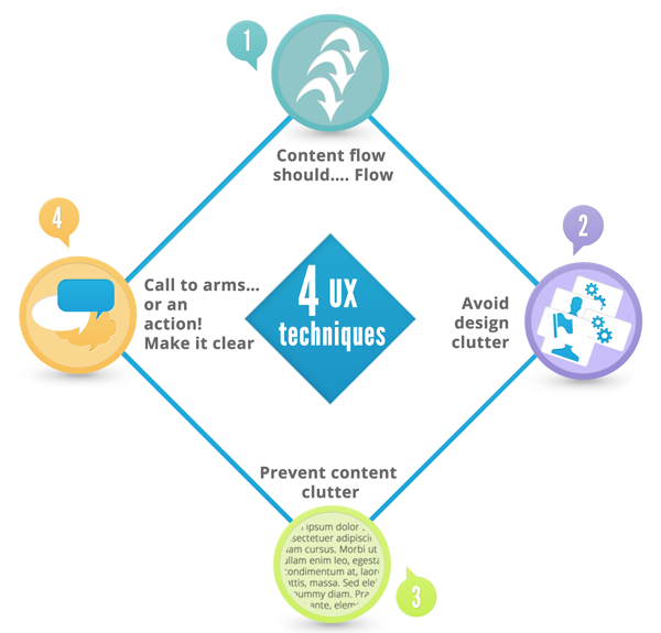
4 Important UX techniques you should employ
- Content flow should…. Flow
How many times have you received an email that has a very confusing flow to it? Not just because of too many elements or too much copy, but also in the way that you are being guided through it. If there is navigation within the email, it should be intuitive and easy to interact with. If the content of the mail has multiple sections, each section should ideally have supporting headings so that the audience can easily identify them. - Avoid design clutter
Many emails are victims of 'over design' with a myriad of big images, content dividers, sidebars and other colourful distractions. While the email design itself might look good inside Photoshop, it doesn’t necessarily mean it will look good in an email client. Various email clients are cluttered and busy, so a minimalistic approach to the design is best - highlighting the goals of the email and making it easy for the user to action. - Prevent content clutter
An email saturated with text poses much the same problem as one that is over designed. If your email is lengthy and very text-heavy, think about giving each paragraph and section room to breathe. This can be done by leaving relatively large spaces between copy and sections, which helps split the email into easy to read chunks and avoids overwhelming your audience with text. - Call to arms… or an action! Make it clear
“If I can’t see it, I’ll never know that I wanted it!” A rather basic, yet very often over-looked element of your email is the call to action. Why are you sending this email out? Do you want your audience to sign up for new services? Buy products? Perhaps you want them to know about a great new service that you’re offering? Whatever the aim, let your recipients take action in an easy way! People generally won’t scroll down a long email before seeing a call to action. Highlight your call to action - make it stand out and make it easy to take action.

Functionality trumps all, always.
These 4 basic, yet very important tips will help ensure your emails are functional and designed to maximize response. Remember, when it comes to emails, functionality is king! Are your emails delivering a great user experience? Take the test:
| The designs do not interfere with your desired message | ||
| All key messages and call to action references are clear and easy to action | ||
| The designs have mobile device compatibility in mind |
If you aren't getting the desired response from your emails, and need further advice from an email marketing specialist,then get in touch!
James Cacchioni
striata.com
2 comments:
very useful and very informative post this is.thanks for share with us...get ordained online
very effective and useful post it is.all post are very informative and useful in this blog.people can get very useful news here.thanks for posting..keep posting....Best listing site on the web
Post a Comment