I don't think I'm unique in my expectation of a decent user experience regardless of which device serves up my content.
This is not another blog post on designing for mobile email, rather I think the real issue is we're experiencing another seismic shift in user behaviour. In my view, this behaviour is being driven by two key developments: mobile device adoption and touch screens.
The good old days ...
Back when Internet access was only via a desktop or laptop, marketers had to get to grips with designing for traditional screen sizes (remember ‘below the fold'?). We used eye tracking to test how people read online, and we counted ‘clickthroughs' when measuring our email engagement.
Along came devices such as smartphones and tablets, and consumer behaviour is once again evolving.
Multiple devices, multi-screen-size approach
If you're like me, you check your email incessantly on your smartphone throughout the day. I scan through the latest arrivals on my iPhone, make a mental note and take action when back at my laptop (at the office) or tablet (at home). Certain actions - such as detailed replies, inserting answers to multiple questions, registering for competitions, taking up offers and unsubscribing from newsletters – are just easier on the larger screen.
The main reason I put off certain tasks is because so many of the communications that land in my inbox are badly designed for a small screen. They require an inordinate amount of finger activity (zooming and scrolling) and facial gestures (frowning and cursing) to carry out the simplest of actions.
Smaller screens require bigger fonts, less images, simpler design, a concise message and large buttons. Statistics have shown that over 50% of mobile click-throughs are made in error. The more difficult it is to take action due to scrolling or clicking, the more likely a user will make a mistake or exit the process in a huff.
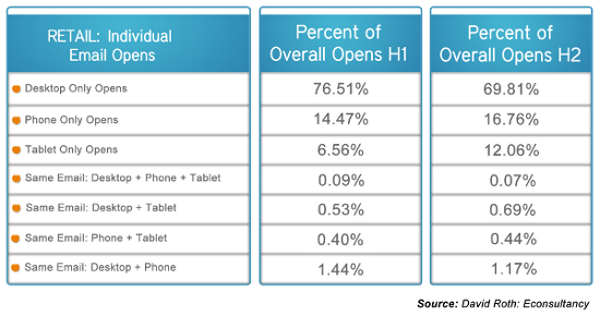
Research shows that smartphone (small screen) opens will overtake desktop (large screen) opens by the end of 2013, while multi-device opens are surprisingly low, showing that not everyone uses my 'read later' tactic.
There's no doubt in my mind that device penetration is driving a shift in user behaviour which in turn requires an evolution in how marketers design email communications. Whether a consumer uses one device or swops between multiple devices, the reality is they could open your email on any number of screen sizes.
Click vs touch
In the past, we didn't have to consider the way devices would be held. Desktops and laptops were pretty much positioned the same way by everyone – on a desk with a mouse. Touch screens were only available on ‘kiosks'.
The way individuals hold their mobile devices and interact with their screens is driving the next shift in email user behaviour. 49% of touch-screen smartphone users hold and interact with one hand – with the right-hand being dominant (Litmus webinar April 2013). Tablet users add the ‘double thumb' action. If you looked at a heat map of typical interaction separating ‘clickers' from ‘touchers', the user behaviour would be vastly different.
Yet many emails are still designed to scroll and click in the middle of the screen, as if the user is at their desk with a mouse.
Email communicators need to carefully consider the placement of the call-to-action across device interfaces. Content length and placement, buttons, spaces between buttons and images all become vitally important elements in getting the user experience right, regardless of device.
Users have high expectations
The basic objectives of the email marketer haven't changed: email campaigns still need to maximise engagement and conversions. What has changed is the behaviour of the people you are looking to engage. Whether you introduce responsive design or track touch screen interaction – you will have to adapt your email design to continue improving your open rates.
Here are some fundamental truths that will not change, regardless of what else does:
- Use tools that allow you to view your email rendering across popular screen sizes
- Test for both the click and touch user experience
- Measure and track everything
- Adjust according to what your metrics are telling you
How are you approaching email user behavioural changes? Need advice? Then get in touch
Nicola Els
striata.com
No comments:
Post a Comment